


Making a room look bigger with color: techniques and tips
What if the key to opening up your home lies not in pristine white, but in a carefully curated palette of colours? Far from shrinking a room, certain shades, when used wisely, create the illusion of greater volume and light. By playing with the psychology of cool tones and the warmth of earthy neutrals, you can transform how your walls are perceived. Let these techniques guide you in reimagining your decor, for a space that feels both larger and more personal.
Do you feel like your walls are closing in, that your living space lacks air and lightness? The first idea that often comes to mind to visually enlarge a room is to paint everything white. However, this solution is not the only one, nor is it always the most inspiring. Did you know that color, far from shrinking a space, can become your most powerful ally in creating the illusion of a more generous, brighter, and deeply welcoming volume? Enlarging a room with color is an art that relies on the psychology of hues, plays of light, and precise painting techniques. This article reveals all the strategies, from the most classic to the boldest, to transform your interior by harnessing the full potential of the color palette. We will explore how light colors reflect light, how cool tones recede visually, and how strategic accents can energize the space without overwhelming it. Get ready to rediscover your home in a new light, more spacious and more personal.
Color Psychology: Understanding How It Influences Space Perception
Before choosing a paint can, it is essential to understand how our brain interprets colors. This science, color psychology, is fundamental for visually enlarging a room. Colors are not mere pigments; they convey sensations of warmth, distance, and ambiance that directly alter our perception of dimensions.
So-called "cool" colors – such as blues, aqua greens, and grays with bluish undertones – have a remarkable property: they seem to move away from us. In painting, we talk about "receding" colors. Applying a cool hue on a wall will make it appear more distant, thus creating an impression of increased space. Conversely, "warm" colors – reds, oranges, bright yellows – are perceived as "advancing." They seem to come closer to the observer, which can be intimidating in a small area but bring warmth to a large volume.
Brightness also plays a key role. Light colors, from off-white to the softest pastel, reflect natural and artificial light. This reflection diffuses brightness throughout the room, softens corners, and minimizes cast shadows, contributing to an opening effect. Dark colors, by absorbing light, can create contrast and depth, but must be used with a precise strategy to avoid closing in the space.
The Power of Light and Neutral Tones: A Solid Foundation to Widen Space
While light tones are an obvious choice for enlarging a room, their selection should not be limited to pure white. A too clinical white can appear cold and sterile. The current trend favors nuances of warm whites and neutrals that bring brightness without sacrificing character.
Think of off-whites tinted with greige, taupe, linen, or a hint of pale pink. These colors reflect light wonderfully while creating a soft and enveloping atmosphere. Very light grays, especially those with blue or green undertones (like "grisaille" gray), are excellent for enlarging a room while giving it a modern elegance.
The trick lies in chromatic unity. To maximize the space effect, use the same family of light tones on all walls, the ceiling, and even the moldings. This visual continuity removes the breaks that fragment the space. This is then referred to as the "color washing" technique or the monochrome box, where subtle differences in texture (matte, satin) take over from color variety.
Trendy Neutrals: Going Beyond White
2026 trends see the emergence of earthy and soothing neutrals, perfect for creating spaces that seem larger. "Greige beige," a mix of gray and beige, is a must-have. "Green white" (a white with a tiny hint of sage green) brings freshness and serenity. Very pale ochre, almost a light sand, injects a touch of solar warmth without weighing down the room. These colors act as a luminous setting that highlights furniture and art without competing with them.
The Cool Tone Trick: Creating Depth and Making Walls Recede
To literally give the impression that a wall is receding, call upon the cool palette. A wall painted in a pale blue, aqua green, or pearl gray will appear farther away than it actually is. This technique is particularly effective in narrow rooms (like a hallway) or those with a very short wall that you want to balance.
You can apply a cool color on the far wall of a long room to visually "bring closer" the other end. In a bedroom, painting the headboard wall in a cool pastel tone (lavender blue, mint green) creates a pleasant perspective effect. The important thing is to keep the other walls in very light shades, even white, to avoid saturating the space with cold.
Cool colors are also known for being calming. Using them to enlarge a room with color like a bedroom or home office thus combines visual and psychological benefits, promoting a feeling of space and tranquility.
The Accent Wall or Feature Wall Technique: Focusing the Gaze to Energize
Contrary to popular belief, a strong or dark color can help enlarge a room, provided it is used strategically. The accent wall (or "feature wall") technique involves painting only one wall in a deep or vibrant hue, while the others remain very light.
How does it work? By drawing the eye to a precise focal point, the accent wall creates a visual hierarchy. The eye is captivated by this point, then scans the surrounding, clear, and open space. This focus gives relief and depth to the room, avoiding the flatness that can sometimes accompany an all-over light monochrome.
For an optimal effect, choose the wall farthest from the entrance or an architecturally interesting wall (with a fireplace, niches). Trendy colors for an accent wall aimed at enlarging space are midnight blues, dark forest greens, deep terracottas, or even a matte black. The effect is spectacular and sophisticated.
Paint Games and Finishes: Lines, Stripes, and Visual Effects
Painting is not limited to a uniform application. Graphic techniques can literally redraw a room's proportions and contribute to visual enlargement through color.
Horizontal stripe painting, for example, is a classic for widening a narrow room. Draw alternating stripes of colors (for example, white and very pale blue) on all walls. The eye naturally follows these horizontal lines, creating an impression of width. Conversely, vertical stripes, from floor to ceiling, will accentuate the ceiling height, ideal in an apartment with low ceilings.
A more contemporary and very effective technique is "gradient" or "ombre" painting. It involves painting a wall from darkest (at the bottom) to lightest (at the top), or from one color to another. This effect, often seen with hues like blue fading into white, simulates natural light and gives an impression of elevation and infinity. Finishes also play a role: a matte paint absorbs more light and evens out surfaces, while a satin or glossy finish reflects light and can make a small space sparkle.
Ceiling-Floor-Wall Harmony: A Strategic Continuity
For a perfect illusion of space, the dialogue between the floor, walls, and ceiling must not be neglected. A common mistake is to treat the ceiling last, often in white, creating a sharp limit that "pushes down" the space.
One of the most radical tricks to enlarge a room is to paint the ceiling the same color as the walls, or in a shade only slightly lighter. This fusion removes the visual boundary between the wall and the ceiling, making the "ceiling" as such disappear. The room then seems to rise and expand. This technique works beautifully with light tones and cool pastel colors.
Similarly, creating continuity between the floor and walls can extend the space. If you have light-colored flooring, choose a wall color from the same warm family (beige, greige). For a gray tile floor, opt for walls in a lighter gray. The idea is to avoid overly strong contrasts that visually section the room into distinct blocks.
The Importance of Natural and Artificial Light
Color does not exist without light. Its interaction with brightness is paramount. The same hue will appear different depending on the room's exposure. To enlarge a room with color, this element must absolutely be taken into account.
A north-facing room, which receives cool and sometimes weak light, will benefit from being painted with warm and bright tones (yellowish whites, creams, very pale peaches) to compensate for the lack of solar warmth and avoid a glacial effect. Conversely, a south-facing room, bathed in warm light, can afford cooler tones (light blues, aqua greens) that will bring freshness and depth without appearing cold.
Artificial lighting is your ally to extend the daytime effect. Use multiple light sources (ceiling light, floor lamps, sconces) to bathe the walls in brightness and avoid shadowy corners that visually shrink the space. Prefer daylight bulbs (4000-5000 Kelvin) for work areas and warmer light (2700-3000K) for relaxation spaces.
The Role of Furniture and Accessories: Completing the Illusion
The color strategy does not stop at the walls. Furniture and decor must follow the same logic to consolidate the illusion of an enlarged space.
Prefer furniture with thin, exposed legs that let you see the floor and create visual transparency. Low furniture (like sofas on legs or glass-top coffee tables) does not block the view. For furniture color, two schools of thought: either you opt for shades that blend into the decor (white furniture on light walls), creating a fluid continuity; or you introduce limited touches of contrasting color (a turquoise armchair in a white living room) that attract the eye and create depth without cluttering.
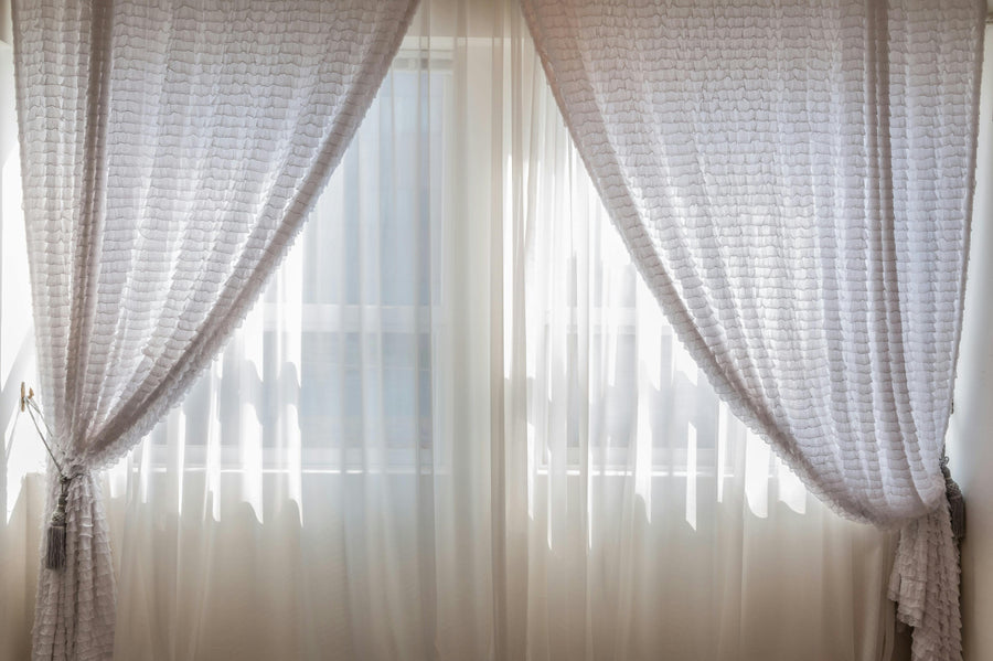
Accessories like curtains are crucial. Curtains hung high, just under the cornice, and falling to the floor, in a color identical or very close to the wall, will significantly lengthen the height of the window and the room. Avoid patterns that are too small and busy, which can "eat up" visual space. Prefer solid fabrics or those with wide, clean patterns.
Colors to Avoid (and How to Work Around Them)
Some colors are known to be difficult in small spaces, but none are totally forbidden if you master their use. Very dark colors (black, chocolate brown, navy blue) or highly saturated ones (bright red, electric orange) absorb a lot of light and can give a feeling of suffocation if applied to all four walls of a small room.
However, as seen with the accent wall, they can be used in a targeted way. Another trick is to use them in an ultra-matte finish, which reduces reflections and creates an impression of deep velvet, less aggressive than a glossy black. They can also be reserved for very specific elements: the inside of a bookcase, the back of a niche, door frames. This way, they add character and contrast without encroaching on the feeling of space.
FAQ: Your Questions About Colors to Enlarge a Room
Is white always the best color to enlarge a small room?
White is an effective tool, but not always the most optimal. A pure white can appear cold and flat, sometimes accentuating flaws. Nuances of warm whites (off-white, cream) or very light pastels (glacier blue, pale anise green) often offer a warmer and equally luminous result, while creating a more personal and less clinical atmosphere.
Can you use black in a small room without crushing it?
Absolutely. Black, used sparingly and strategically, can add depth and drama. The key is to confine it to a single wall (accent wall), to carpentry elements (doors, windows), or to accessories. Pair it with very light walls and generous lighting. A black detail in a light space draws the eye and creates perspective, giving the illusion that the room is deeper.
How to choose the color based on the room's orientation?
Orientation is crucial. For a north-facing room (cool light), favor warm and sunny tones (pale yellows, peaches, creams) to warm up the ambiance. For a south-facing room (warm and abundant light), you have more freedom and can opt for cool tones (blues, grayed greens) that will bring freshness. East-facing rooms (morning light) accept soft greens and pale pinks, while west-facing ones (warm evening light) pair well with softened terracottas and ochers.
Are patterns to be avoided in a small space?
Not necessarily. Large, spaced-out patterns on a light background can create movement and depth. On the other hand, small, tight patterns (polka dots, dense geometric patterns) tend to visually "overload" the space and make it appear more cluttered. If you love patterns, opt for a wallpaper with wide vertical stripes or a large-format botanical pattern on a single wall.
Should I paint the baseboards and doors the same color as the walls?
To maximize the enlargement effect, yes. Painting baseboards, door frames, and window frames the same color as the wall (or an extremely close shade) makes the segmentation elements disappear. The space becomes a fluid and continuous entity, making it appear larger. This is a technique commonly used by interior designers to create clean and spacious volumes.
Conclusion: Dare to Use Color to Transform Your Space
Enlarging a room with color is much more than a simple painting trick; it is a holistic design approach that engages perception, light, and emotion. By understanding the properties of cool and warm hues, playing with strategic contrasts, and harmonizing all elements of the room, you hold the power to redefine the boundaries of your interior. Do not be afraid to experiment with samples on the walls, observe the changes in light throughout the day, and step off the beaten path of all-white. Your home deserves to be a reflection of your personality, both spacious and warm. To discover more inspirations, trendy palettes, and practical guides for every room in the house, immerse yourself in the world of expert advice available on ombreinterieur.fr. Your transformation project starts here. Discover the product Colored Sheer Curtain to finalize your decor. Check out our article how to arrange a kitchen with a Bordeaux TV unit to go further. Browse our online store to see all our collections.